Dear Readers,
Recently while working with one of my clients, I came across a requirement of creating graphical representation of DB growth in last few months. Ofcourse this is possible using excel graphs, I thought of achieving this using python programming.
So I am writing this post on creating graphical representation of data present in text file, however this doesn’t explain how to get DB growth statistics in text file as initial requirement.
For example I have a scheduled job which runs once every month appending DB size stats in same spool file.
Sample query can be used for this:
select to_char(sysdate,'MON-YYYY'),sum(d.bytes+t.bytes)/1024/1024/1024 physical_size,sum(s.bytes)/1024/1024/1024 logical_size from dual,dba_data_files d,dba_temp_files t,dba_segments s;
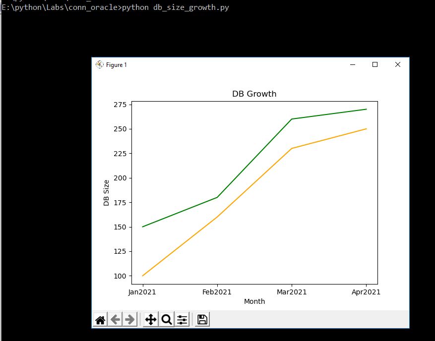
So after 4 months of capturing data, I have below data available in text file:
JAN2021 150 100
FEB2021 180 160
MAR2021 260 230
APR2021 270 250
Now current requirement is for preseting this data graphically to client. I will achieve this using python.
- Line graph:
Line graph or the linear graph is used to display the continuous data.
Code:
# Script Name: db_size_growth.py
# Description: Script to show graphical representation of Oracle DB Growth
# Graph Type: Line groph
# Usage: python db_size_growth.py
# Author: Adityanath Dewoolkar
# Version: 1

# importing required modules
import matplotlib.pyplot as plt

# variable declaration
x = []
y = []
z = []

# code

for line in open('db_growth.txt', 'r'):
    lines = [i for i in line.split()]
    x.append(lines[0])
    y.append(int(lines[1]))
    z.append(int(lines[2]))

plt.title("DB Growth")
plt.xlabel('Month')
plt.ylabel('DB Size')

plt.plot(x, y, color='g')
plt.plot(x, z, color='orange')

plt.show()
Now I will execute this program & see how it looks graphically.
Output:
- Bar graph:
Bar Graph is used to display the category of data and it compares the data using solid bars to represent the quantities.
Code:
# Script Name: db_size_growth1.py
# Description: Script to show graphical representation of Oracle DB Growth
# Graph Type: Bar graph
# Usage: python db_size_growth1.py
# Author: Adityanath Dewoolkar
# Version: 1

# importing required modules
import matplotlib.pyplot as plt
import pandas as pd

# variable declaration
a = []
b = []
c = []

# code
for line in open('db_growth.txt', 'r'):
    lines = [i for i in line.split()]
    a.append(lines[0])
    b.append(int(lines[1]))
    c.append(int(lines[2]))
    df = pd.DataFrame({
        'Month': a,
        'PhysicalSize': b,
        'LogicalSize': c
    })

# plotting graph
df.plot(x="Month", y=["PhysicalSize", "LogicalSize"], kind="bar")
plt.show()
Now I will execute this program & see how it looks graphically.
Output:
You can download these program files from below location:
Hope u will find this post very useful.
Cheers
Regards,
Adityanath


Leave a comment